Project Roles
Art Direction, Digital Design, UI Design, Visual Design
Tools
Figma, Adobe Illustrator, Photoshop
Scope
Website, Branding, Web Media
Approach
I focused on refining the visual system and improving overall usability—specifically typography, hierarchy, and readability. While the original site had a strong foundation, the experience lacked the level of clarity and polish expected from a premium retail brand.
The redesign introduces a more structured layout, clearer product presentation, and a refined typographic system to create a more cohesive and elevated shopping experience.
Outcome
The result is a cleaner, more modern interface that strengthens the brand’s digital presence while improving clarity and ease of navigation across key touchpoints.
BEFORE
AFTER
Annotations below for above numbered points in red.
Visual UI/UX Enhancements with Annotated “Before” Image Breakdown
As part of this self-initiated redesign, I identified usability, accessibility, and visual hierarchy issues throughout the original landing page and implemented design solutions to improve overall performance and user experience. Below is a section-by-section breakdown of the key issues and my corresponding design solutions:
1. Navigation Bar
Problem:
Navigation links are tightly spaced and lack breathing room, making them difficult to read and interact with. Additionally, the navbar height is too compressed, leading to a cramped and unbalanced header.
Navigation links are tightly spaced and lack breathing room, making them difficult to read and interact with. Additionally, the navbar height is too compressed, leading to a cramped and unbalanced header.
Solution:
Increased the padding and spacing between nav links to enhance readability and ease of navigation. Adjusted the height of the navbar to create a more balanced and user-friendly layout that aligns with modern UX standards.
Increased the padding and spacing between nav links to enhance readability and ease of navigation. Adjusted the height of the navbar to create a more balanced and user-friendly layout that aligns with modern UX standards.
2. About Paragraph (Intro Text)
Problem:
Introductory copy is positioned too close to both the navigation and the left edge of the page, making it feel visually cluttered and misaligned.
Introductory copy is positioned too close to both the navigation and the left edge of the page, making it feel visually cluttered and misaligned.
Solution:
Repositioned the content to follow more intuitive content hierarchy and alignment principles. Placed the copy in a section where it feels more natural within the page flow, improving both readability and visual balance.
Repositioned the content to follow more intuitive content hierarchy and alignment principles. Placed the copy in a section where it feels more natural within the page flow, improving both readability and visual balance.
3. Hero CTA
Problem:
Primary call-to-action is difficult to read due to poor contrast with the background image and lacks prominence.
Primary call-to-action is difficult to read due to poor contrast with the background image and lacks prominence.
Solution:
Relocated the CTA to a more accessible area of the hero section. Adjusted the imagery and contrast for improved visibility, while ensuring the CTA complies with accessibility standards.
Relocated the CTA to a more accessible area of the hero section. Adjusted the imagery and contrast for improved visibility, while ensuring the CTA complies with accessibility standards.
4. Secondary CTA (Repeats Hero CTA Issue)
Problem:
Same issues as above—insufficient contrast and poor positioning against the background.
Same issues as above—insufficient contrast and poor positioning against the background.
Solution:
Mirrored the improvements made to the primary CTA, ensuring all key call-to-action elements are consistent, legible, and visually distinct.
Mirrored the improvements made to the primary CTA, ensuring all key call-to-action elements are consistent, legible, and visually distinct.
5. “Book Appointment” CTA
Problem:
The button size is too small and lacks visual emphasis, reducing click-through potential.
The button size is too small and lacks visual emphasis, reducing click-through potential.
Solution:
Increased the CTA size and visual weight to improve visibility and encourage user interaction.
Increased the CTA size and visual weight to improve visibility and encourage user interaction.
6. Product Categories CTA
Problem:
The call-to-action buttons over imagery lack contrast, making them hard to read and reducing their effectiveness.
The call-to-action buttons over imagery lack contrast, making them hard to read and reducing their effectiveness.
Solution:
Redesigned CTA buttons with a cleaner, more legible layout by placing dark text on light backgrounds. This significantly improves visibility and accessibility while maintaining brand aesthetics.
Redesigned CTA buttons with a cleaner, more legible layout by placing dark text on light backgrounds. This significantly improves visibility and accessibility while maintaining brand aesthetics.
7. New Arrivals Section
Problem:
Product modules lack clear separation, and the typographic hierarchy for product names and colors is weak, resulting in a cluttered, hard-to-scan section.
Product modules lack clear separation, and the typographic hierarchy for product names and colors is weak, resulting in a cluttered, hard-to-scan section.
Solution:
Implemented a modular grid system to define consistent spacing and improve clarity. Refreshed typography to establish visual hierarchy and enhanced UI elements for product details and color options.
Implemented a modular grid system to define consistent spacing and improve clarity. Refreshed typography to establish visual hierarchy and enhanced UI elements for product details and color options.
8. Selected Brands Section
Problem:
Auto-scrolling brand logos/images offer no functional benefit and reduce user control. Scrolling also disrupts visual focus and decision-making.
Auto-scrolling brand logos/images offer no functional benefit and reduce user control. Scrolling also disrupts visual focus and decision-making.
Solution:
Removed unnecessary animation and introduced a static, clean grid of curated brand logos. This simplifies navigation and minimizes cognitive load while guiding users to explore brands with greater ease.
Removed unnecessary animation and introduced a static, clean grid of curated brand logos. This simplifies navigation and minimizes cognitive load while guiding users to explore brands with greater ease.
9. Our Stores Section
Problem:
Visual inconsistency and poor layout—copy is too close to page edges, and the use of studio fashion images does not represent the physical retail experience.
Visual inconsistency and poor layout—copy is too close to page edges, and the use of studio fashion images does not represent the physical retail experience.
Solution:
Applied a responsive grid system to establish clean alignment and improve spacing. Replaced studio shots with actual storefront images to give users a better sense of place and encourage real-world engagement.
Applied a responsive grid system to establish clean alignment and improve spacing. Replaced studio shots with actual storefront images to give users a better sense of place and encourage real-world engagement.
10. Footer
Problem:
Lacks clear visual structure, hierarchy, and essential links typically expected in a modern footer. No option for email sign-up or customer engagement.
Lacks clear visual structure, hierarchy, and essential links typically expected in a modern footer. No option for email sign-up or customer engagement.
Solution:
Designed a comprehensive footer section following UX best practices. Included newsletter sign-up, useful navigation links, social media, and clear contact information. Improved the layout to provide a stronger sense of closure and support site-wide navigation.
Designed a comprehensive footer section following UX best practices. Included newsletter sign-up, useful navigation links, social media, and clear contact information. Improved the layout to provide a stronger sense of closure and support site-wide navigation.
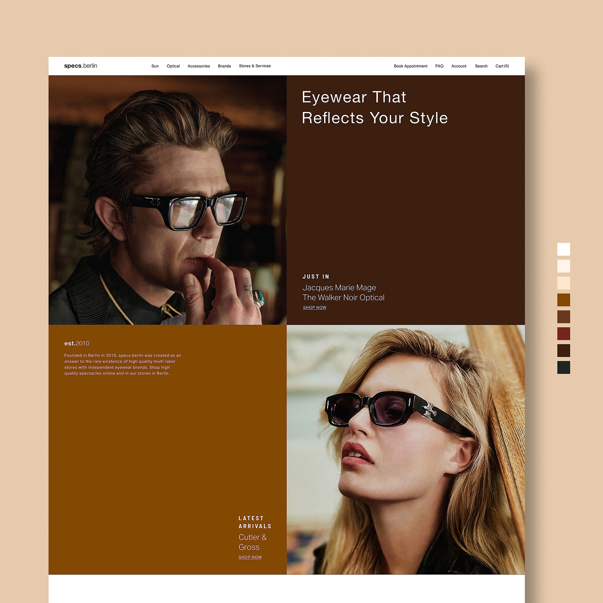
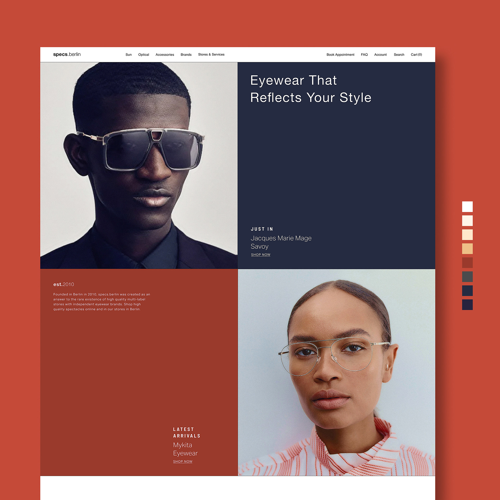
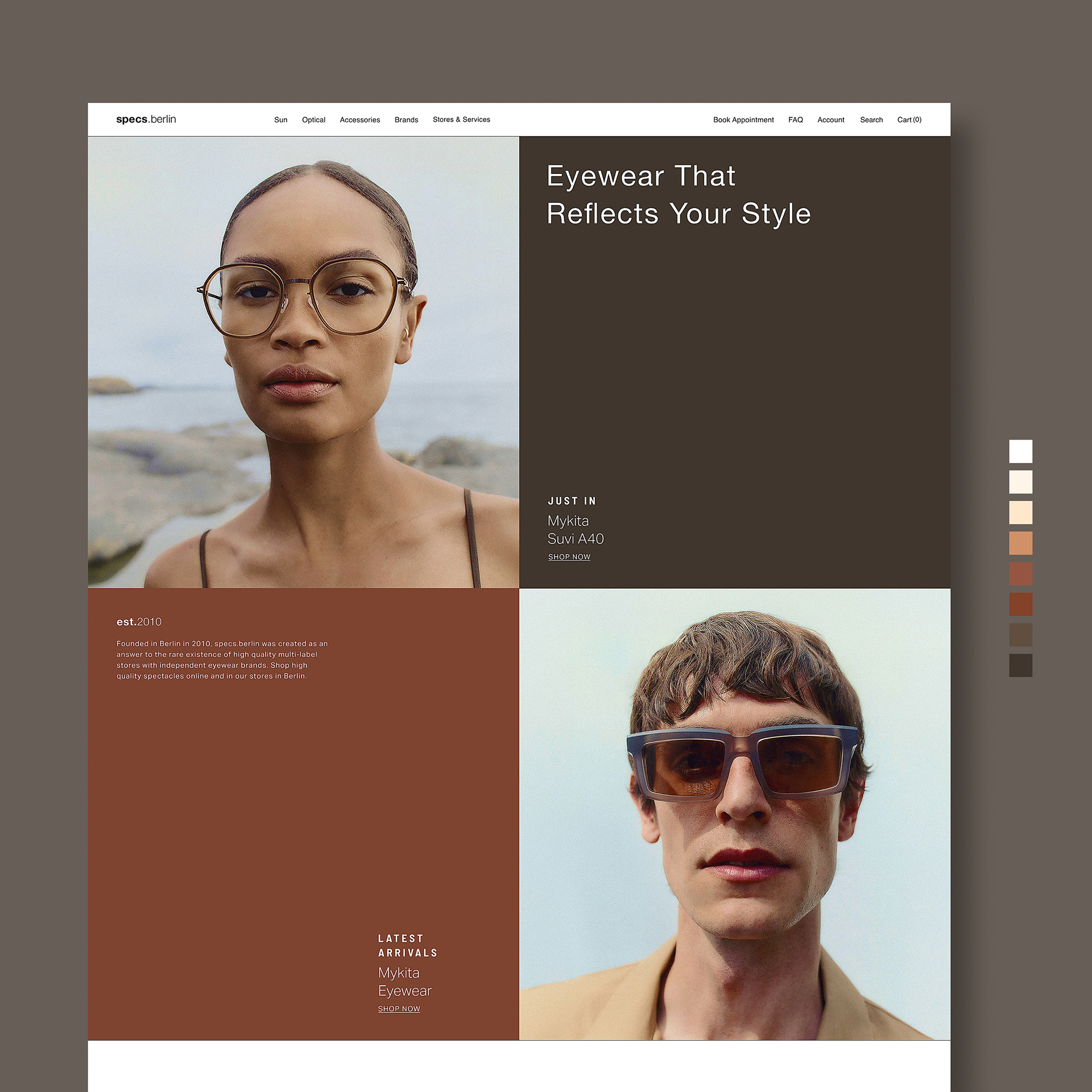
Images below features all best and alternate landing page explorations and designs.

Disclaimer: This project is a conceptual redesign of the Specs Berlin website created for portfolio purposes only. I do not own the rights to any images used in this project. All images featured are part of official advertising campaigns from their respective eyewear brands and are used by retailers and e-commerce platforms for promotional purposes. This redesign is an independent exploration and is not affiliated with, endorsed by, or commissioned by Specs Berlin or any associated brands. The work presented here is intended solely to showcase design improvements and creative problem-solving.