Project Roles
Art Direction, Brand Identity, Digital Experience Design
Tools
Figma, Adobe Illustrator, Photoshop
Scope
Brand Identity, Web Experience, Landing Page, About Page
Studio Brand & Digital Experience
Nexis is a conceptual architecture studio brand rooted in clarity, structure, and modernist principles. The identity draws inspiration from Swiss design and constructivist art, using a disciplined grid system, bold geometric forms, and restrained typography to create a cohesive and timeless visual language.
The objective was to develop a brand that reflects the precision of architectural practice while translating seamlessly into a digital experience. Through a balance of expressive composition and functional clarity, the design emphasizes hierarchy, rhythm, and visual consistency across all touchpoints.
Art Direction & Visual System
The visual direction is grounded in Swiss modernism, where structure and clarity drive the design. A geometric language of circles, squares, and triangles is used throughout the experience to reinforce composition and create visual anchors across layouts.
A restrained palette—anchored by neutral tones and punctuated with bold accent colors—establishes contrast and hierarchy while maintaining a refined, architectural feel.
Black-and-white imagery was selected to highlight form, material, and structure without distraction, allowing the layout and typography to remain the primary focus.
Outcome
Nexis demonstrates how a disciplined visual system can translate into a cohesive digital experience. By combining modernist principles with a structured design approach, the project achieves a balance between aesthetic clarity and expressive composition.
The result is a refined, architecture-driven brand that communicates precision, creativity, and intention across every touchpoint.

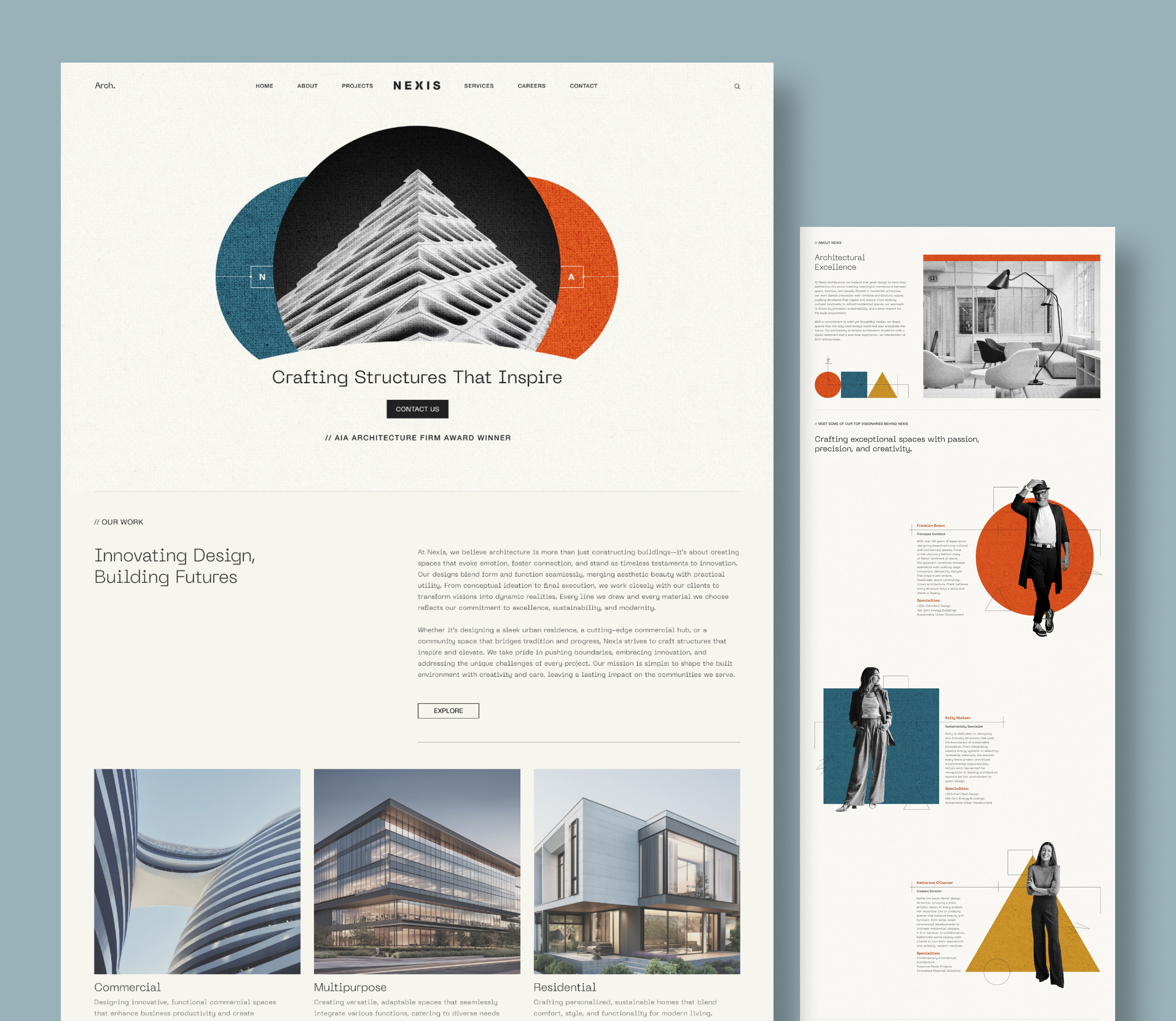
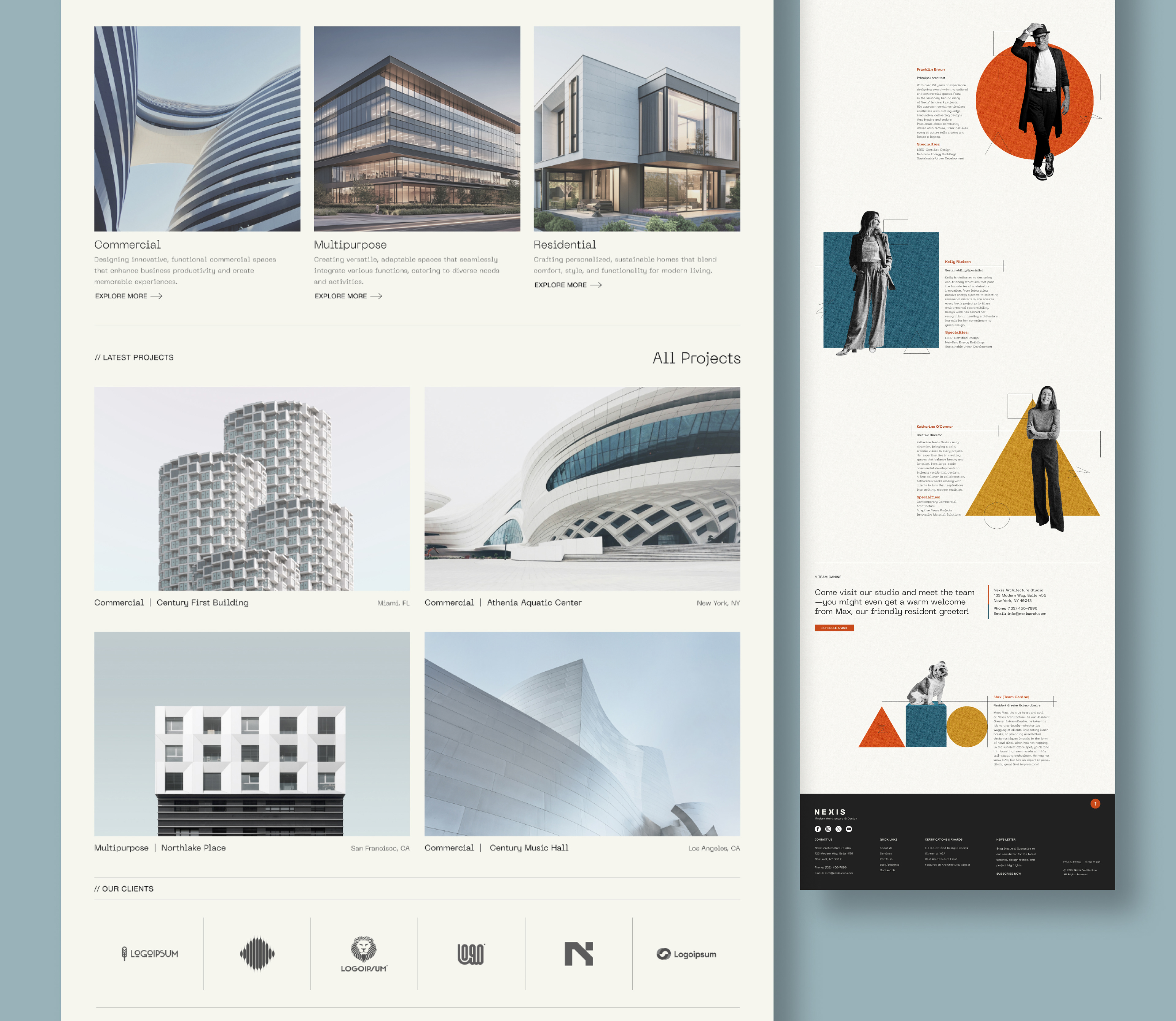
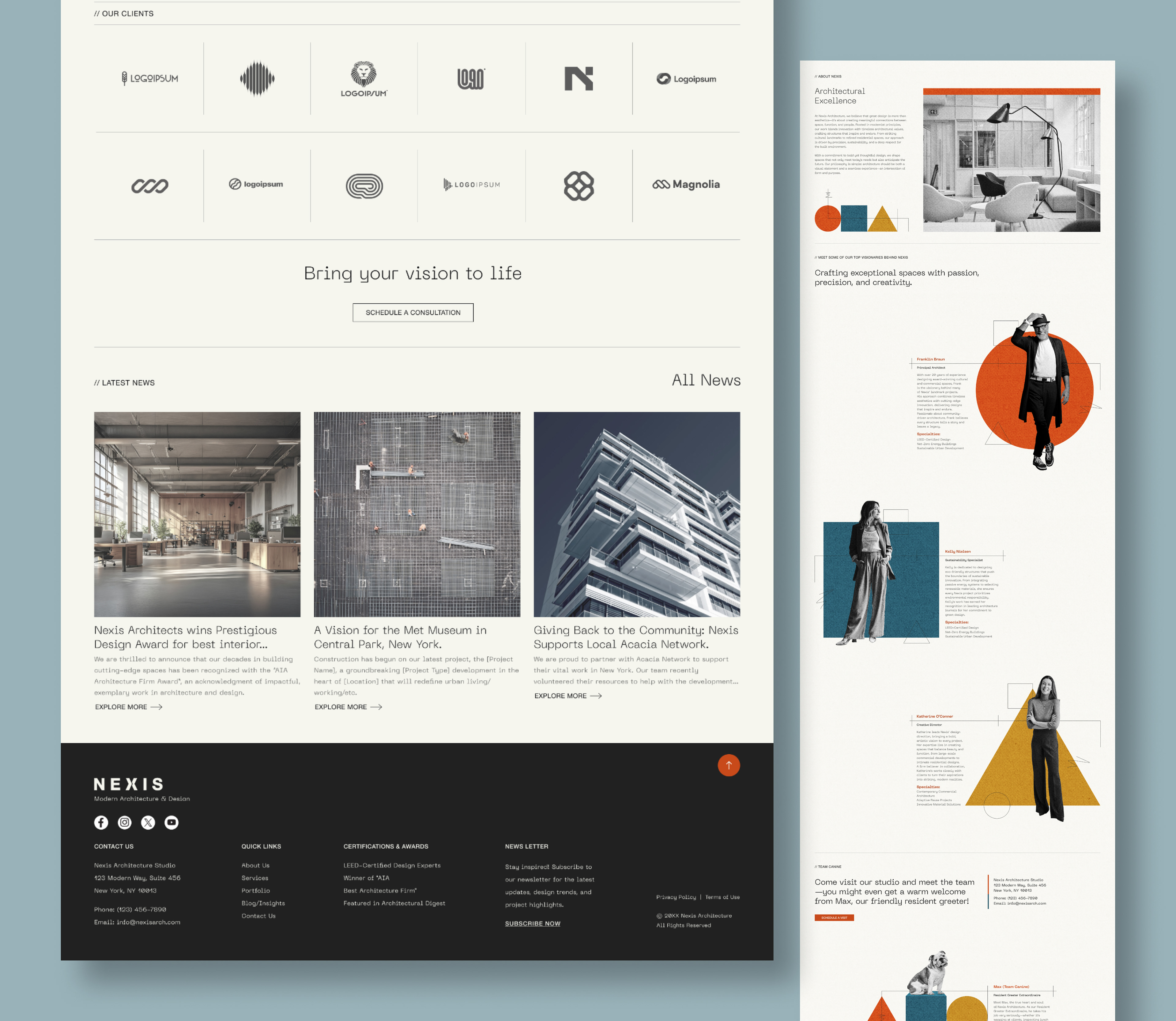
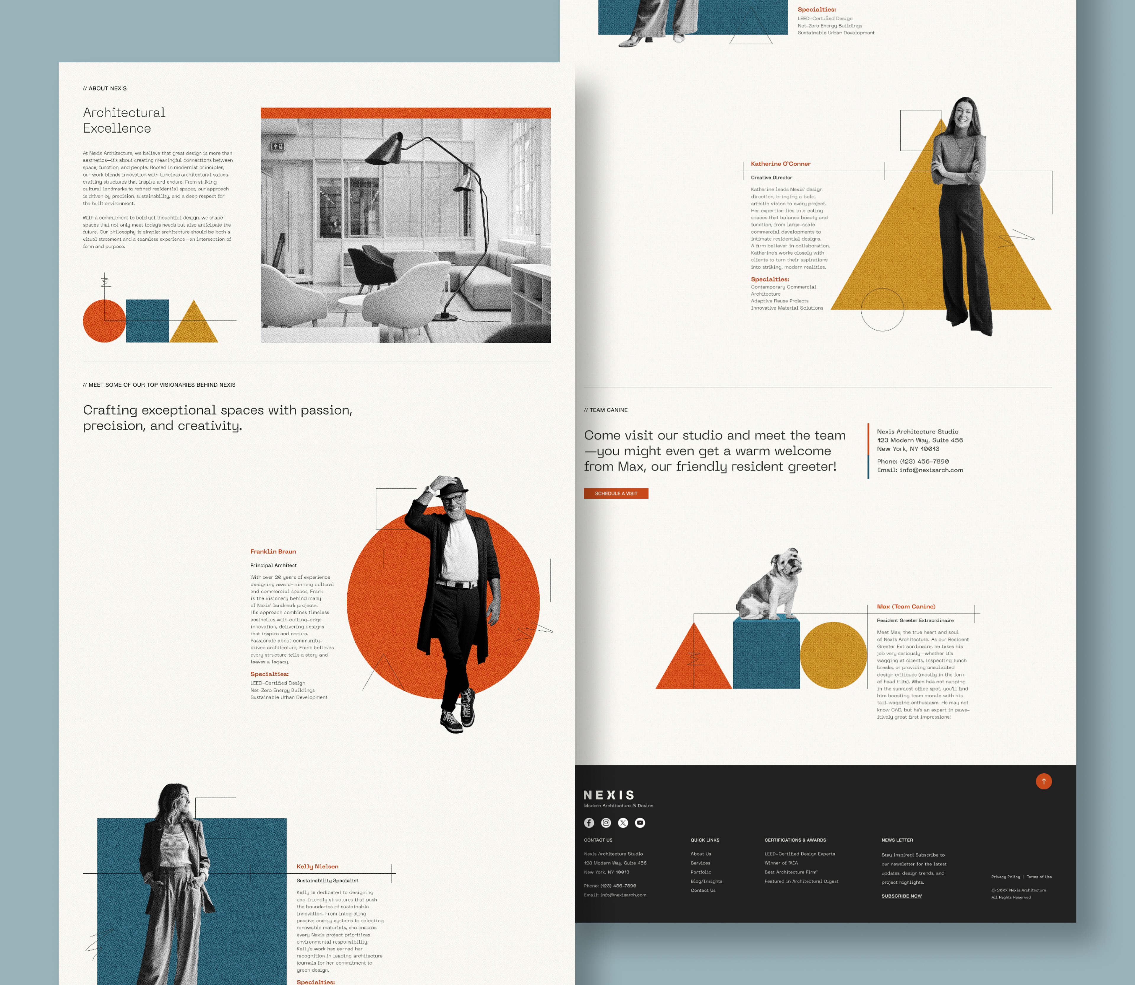
About Page — Humanizing the Brand
The About page introduces a more expressive and approachable tone while maintaining the core visual system.
Black-and-white portraits of team members are paired with bold geometric shapes, creating contrast between structure and personality. This balance reinforces both the professionalism and human side of the studio.
A playful moment is introduced through “Max,” the studio’s resident greeter, adding warmth and relatability while maintaining visual consistency with the overall design language.
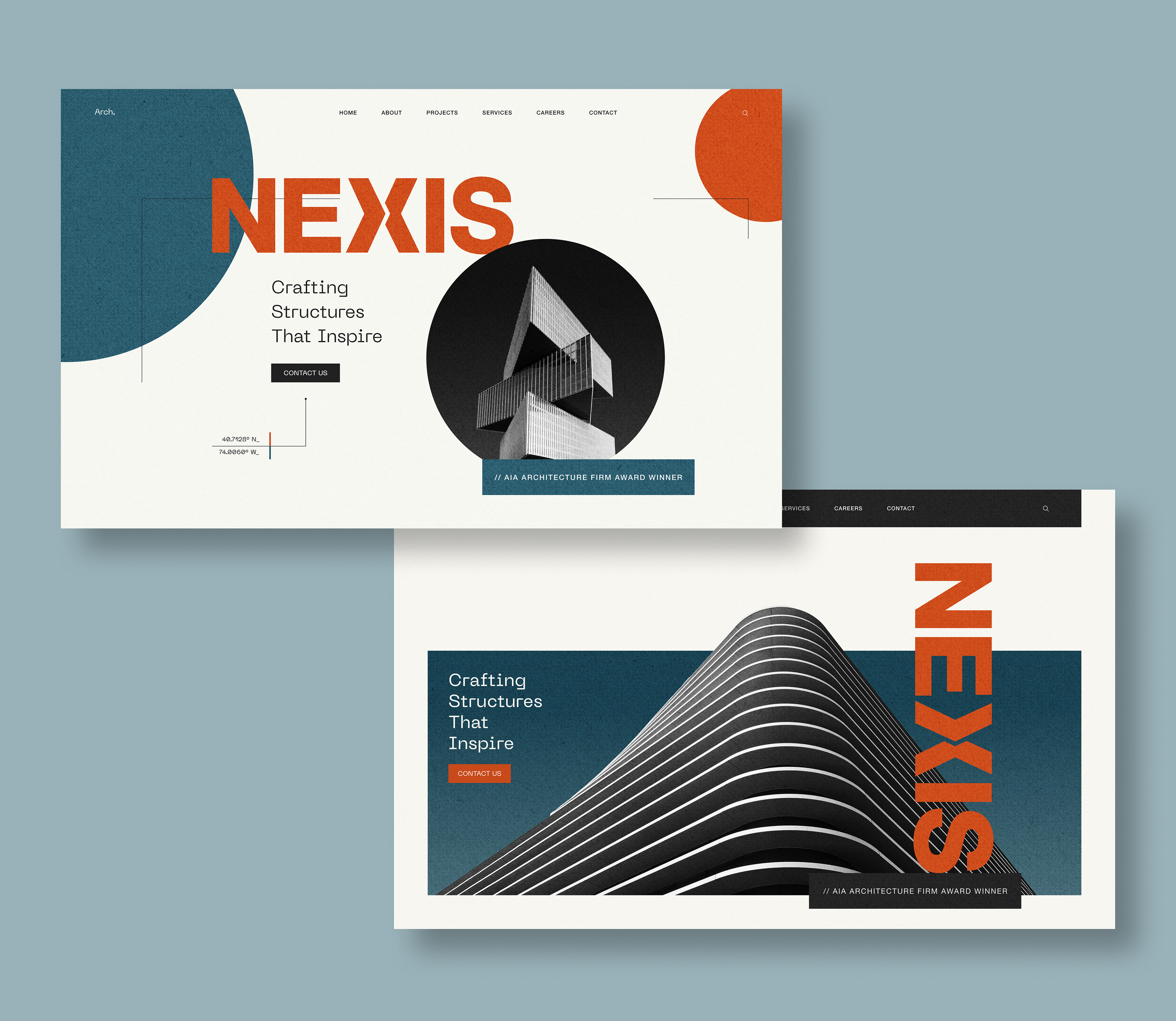
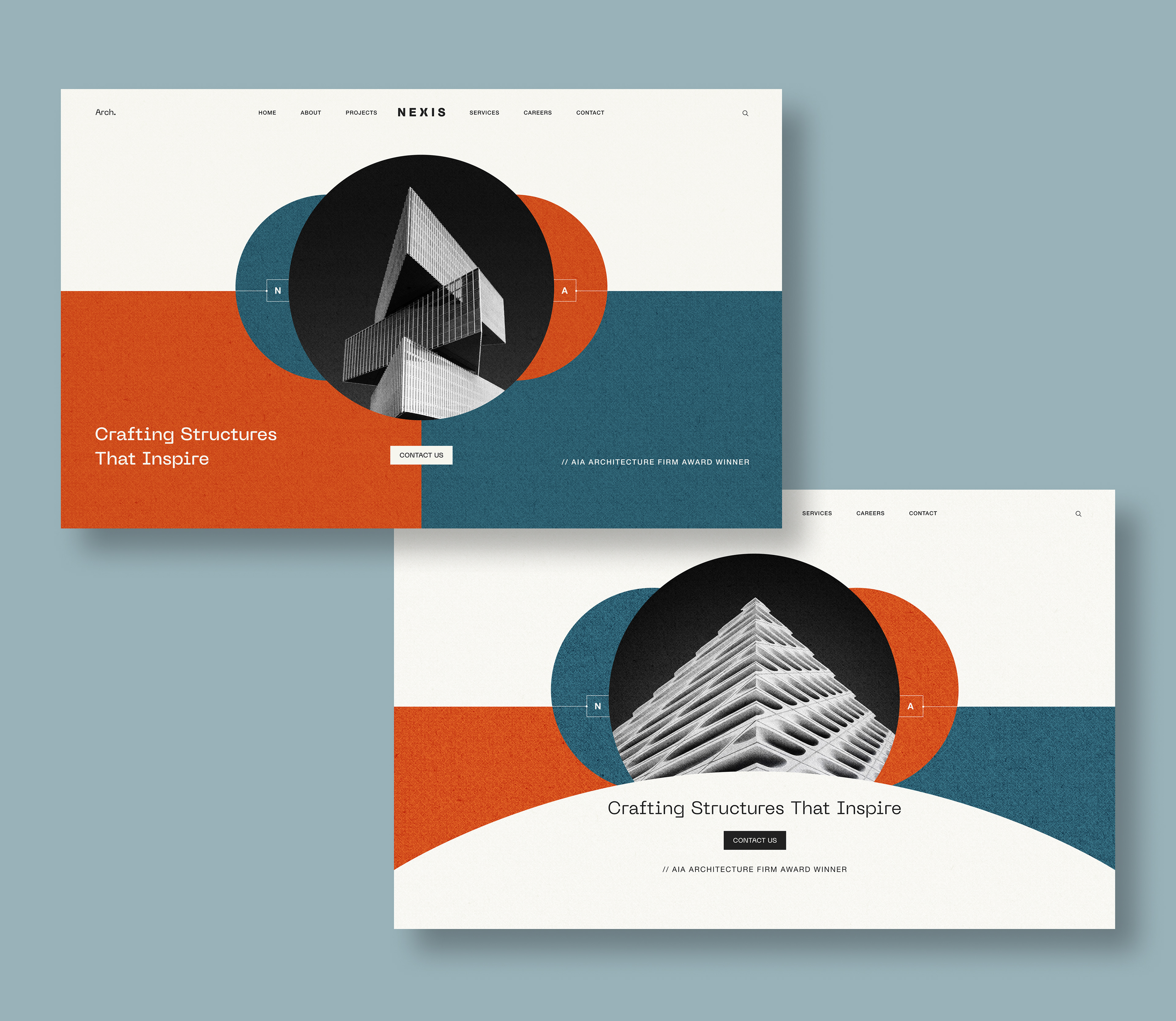
Explorations — Hero Variations
As part of the art direction process, I explored multiple hero compositions to understand how scale, geometry, and hierarchy could shape the first impression of the brand.
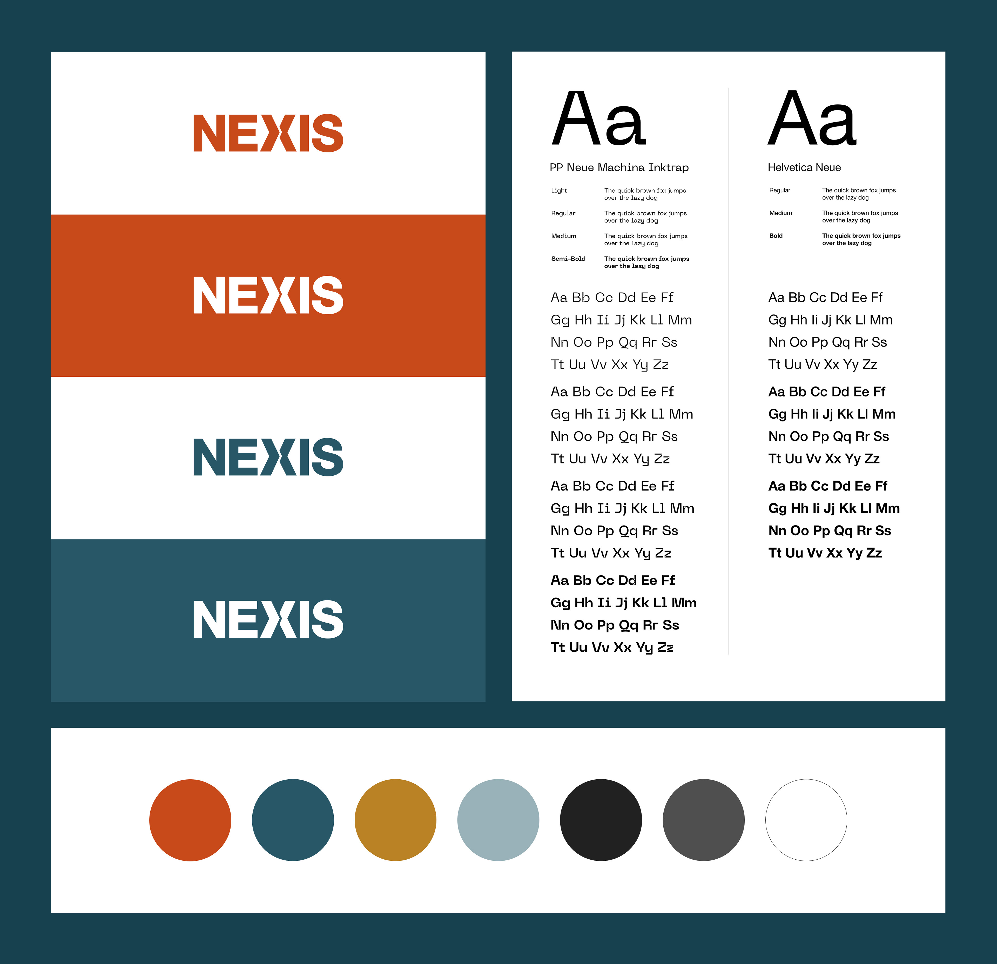
Design System
The Nexis design system establishes a cohesive foundation across typography, color, and form.
- Color Palette: A balance of neutral tones and bold accents used to create hierarchy and focal points
- Typography: A dual-type system balancing structure and expression
- Geometric Language: Repeating shapes used as compositional elements across layouts
Together, these elements form a flexible system that scales across digital applications while maintaining a consistent brand identity.